
Part 11 · Module 5
Receiver Operating Characteristic Curves
Learn how ROC curves display sensitivity–specificity trade-offs across thresholds, how AUC measures ranking discrimination, and how curves and AUCs should be interpreted.
Learning outcomes
After completing this lecture, you should be able to:
- Construct and interpret a receiver operating characteristic curve.
- Explain the relationship between thresholds, sensitivity and false-positive rate.
- Interpret area under the ROC curve as a ranking probability.
- Distinguish discrimination from calibration, predictive value and clinical utility.
- Calculate AUC confidence intervals and compare paired ROC curves conceptually.
- Use R code with pROC to estimate and plot ROC curves.
Overview
A receiver operating characteristic, or ROC, curve displays diagnostic performance across every possible threshold of a continuous or ordinal test.
The vertical axis is:
The horizontal axis is:
Each point represents one threshold.
The area under the ROC curve, AUC, summarises ranking discrimination across thresholds.
ROC methods are useful for exploring a marker’s ability to separate diseased and non-diseased participants, but they do not select a clinically appropriate threshold automatically.
Why this matters
A continuous biomarker contains more information than one binary cut-off.
A single 2 × 2 table cannot show the full sensitivity–specificity trade-off.
However, AUC is often overinterpreted.
AUC does not directly show:
- PPV or NPV;
- calibration;
- clinical consequences;
- preferred threshold;
- benefit of testing;
- performance in a restricted clinically relevant specificity range.
ROC analysis should therefore be connected to intended use and decision consequences [1].
When to use ROC analysis
Use ROC analysis when:
- the test result is continuous, ordinal or risk-score based;
- higher or lower values correspond consistently to disease;
- target-condition status is binary;
- thresholds are not yet fixed or several thresholds are relevant.
Do not use ordinary ROC analysis to assess:
- probability calibration;
- multi-class outcomes without extension;
- time-dependent outcomes without time-dependent ROC methods;
- clinical utility without consequence weighting.
Research question and variables
For threshold , when higher values indicate disease:
The ROC curve plots these pairs as varies.
Data structure
Continuous-test data
simulated data| Variable | Role |
|---|---|
score_a | Continuous Test A value |
score_b | Continuous Test B value |
disease | Binary reference status |
id | Participant identifier for paired comparison |
Both tests are measured in the same participants, so their AUC estimates are correlated.
Statistical assumptions
How the curve works
As the threshold decreases:
- more diseased participants test positive;
- more non-diseased participants also test positive;
- sensitivity rises;
- false-positive rate rises.
The no-discrimination diagonal has AUC 0.5.
A perfect ranking has AUC 1.0.
An AUC below 0.5 often indicates reversed direction rather than a useful anti-test.
Worked example
Worked analysis in R
The pROC package implements ROC estimation, AUC confidence intervals and paired DeLong comparisons [4].
make_diagnostic_data <- function(n = 400) {
  id <- seq_len(n)
  age <- 20 + ((7 * id) %% 61)
  male <- as.integer(id %% 2 == 0)

  disease <- as.integer(
    ((id * 37) %% 100) < 30
  )

  score_a <-
    47 +
    11 * disease +
    0.08 * (age - 50) +
    7.5 * sin(id * 1.13) +
    3.5 * cos(id * 0.37)

  score_b <-
    48 +
    9 * disease +
    0.05 * (age - 50) +
    7.2 * sin(id * 1.13 + 0.45) +
    4.0 * cos(id * 0.37 + 0.20)

  disease_rank <- (id * 43) %% 100
  nondisease_rank <- (id * 47) %% 100

  reference_positive <- ifelse(
    disease == 1,
    disease_rank < 88,
    nondisease_rank >= 95
  )

  data.frame(
    id = id,
    age = age,
    male = male,
    disease = disease,
    score_a = score_a,
    score_b = score_b,
    reference_positive = as.integer(
      reference_positive
    )
  )
}

diagnostic_data <- make_diagnostic_data()

cutoff_a <- 51.962318662698785
cutoff_b <- 55.26626112612387

diagnostic_data$test_a_positive <- as.integer(
  diagnostic_data$score_a >= cutoff_a
)

diagnostic_data$test_b_positive <- as.integer(
  diagnostic_data$score_b >= cutoff_b
)

library(pROC)

roc_a <- roc(
  response = diagnostic_data$disease,
  predictor = diagnostic_data$score_a,
  levels = c(0, 1),
  direction = "<",
  ci = TRUE
)

roc_b <- roc(
  response = diagnostic_data$disease,
  predictor = diagnostic_data$score_b,
  levels = c(0, 1),
  direction = "<",
  ci = TRUE
)

roc_a
ci.auc(
  roc_a,
  method = "delong"
)

roc_b
ci.auc(
  roc_b,
  method = "delong"
)

paired_comparison <- roc.test(
  roc_a,
  roc_b,
  paired = TRUE,
  method = "delong"
)

paired_comparison

plot(
  roc_a,
  legacy.axes = TRUE,
  print.auc = TRUE,
  xlab = "False-positive rate",
  ylab = "Sensitivity"
)

plot(
  roc_b,
  add = TRUE,
  legacy.axes = TRUE
)

legend(
  "bottomright",
  legend = c("Test A", "Test B"),
  lty = 1:2
)
Selected analysis output
Test A AUC = 0.895
Test B AUC = 0.857
Paired AUC difference = 0.037
Approximate 95% CI = 0.019 to 0.055
DeLong p < 0.001
The exact package output may vary slightly with the installed pROC version, but learners can recalculate the displayed values from the simulated data and code above.
Visualising ROC curves
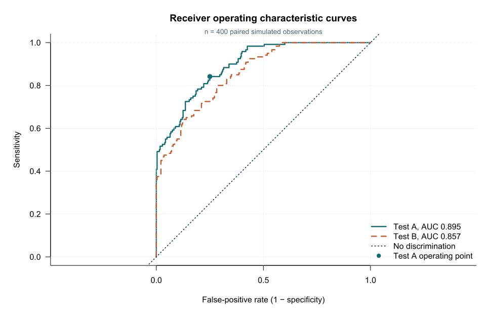
A ROC plot should label:
- sensitivity;
- false-positive rate or specificity;
- AUC with confidence interval;
- test direction;
- clinically relevant operating points.
Interpreting AUC
AUC is insensitive to prevalence mathematically when sensitivity and specificity distributions remain fixed.
However, changing prevalence often changes participant spectrum and therefore the observed score distributions.
AUC also weights every possible threshold, including thresholds that may never be clinically acceptable.
Partial AUC
A partial AUC focuses on a prespecified region.
Examples:
- specificity at least 90%;
- sensitivity at least 95%.
Partial AUC can be more relevant for a test with a clear triage or confirmatory role.
The region and scaling should be prespecified.
ROC versus calibration
A risk model can have high AUC but systematically overestimate or underestimate disease probability.
Calibration asks whether predicted probabilities match observed frequencies.
ROC discrimination alone is insufficient for a clinical prediction model.
ROC versus predictive values
ROC coordinates condition on disease status.
Predictive values condition on test results and depend on prevalence.
AUC does not indicate how many positive tests are false positives.
Smoothing
Smoothed ROC curves can improve visual appearance but may introduce model assumptions and alter empirical operating points.
The empirical ROC curve should remain available.
Interpreting the output
Presenting the results
Suggested reporting
STARD recommends reporting how index-test results were handled and how accuracy estimates were calculated [5].
For ROC analyses, also report AUC interval, test direction, threshold-selection method, paired design and relevant partial AUC or operating points.
Common mistakes
Knowledge check
What does one ROC point represent?
Answer and reasoning
Sensitivity and false-positive rate at one threshold.
What does AUC 0.895 mean?
Answer and reasoning
A randomly selected diseased participant has a higher Test A score than a randomly selected non-diseased participant about 89.5% of the time.
Does AUC identify the best clinical cut-off?
Answer and reasoning
No. Threshold choice requires intended use and error consequences.
Why use a paired AUC comparison?
Answer and reasoning
Both tests are measured in the same participants, so their AUC estimates are correlated.
Can a model have high AUC and poor probability calibration?
Answer and reasoning
Yes. Ranking and calibration are different performance dimensions.
Key take-home messages
References
- Metz CE. Basic principles of ROC analysis. Semin Nucl Med. 1978;8(4):283–298. https://doi.org/10.1016/S0001-2998(78)80014-2
- Hanley JA, McNeil BJ. The meaning and use of the area under a receiver operating characteristic curve. Radiology. 1982;143(1):29–36. https://doi.org/10.1148/radiology.143.1.7063747
- DeLong ER, DeLong DM, Clarke-Pearson DL. Comparing the areas under two or more correlated receiver operating characteristic curves: a nonparametric approach. Biometrics. 1988;44(3):837–845. https://doi.org/10.2307/2531595
- Robin X, Turck N, Hainard A, Tiberti N, Lisacek F, Sanchez JC, et al. pROC: an open-source package for R and S+ to analyze and compare ROC curves. BMC Bioinformatics. 2011;12:77. https://doi.org/10.1186/1471-2105-12-77
- Bossuyt PM, Reitsma JB, Bruns DE, Gatsonis CA, Glasziou PP, Irwig L, et al. STARD 2015: an updated list of essential items for reporting diagnostic accuracy studies. BMJ. 2015;351:h5527. https://doi.org/10.1136/bmj.h5527
These notes support learning and research planning and do not replace statistical consultation for a specific study.