
Part 8 · Module 1
Correlation Analysis
Learn how Pearson and Spearman correlation describe association without implying causation, agreement or prediction.
Learning outcomes
After completing this lecture, you should be able to:
- Distinguish association, causation, agreement and prediction.
- Select Pearson or Spearman correlation according to the research question and data pattern.
- Calculate and interpret a correlation coefficient and 95% confidence interval.
- Use a scatter plot to assess direction, form and influential observations.
- Explain the effects of non-linearity and range restriction.
- Use reproducible R code to perform and report correlation analysis.
Overview
Correlation describes the direction and strength of association between two variables.
For two numerical variables, common coefficients are:
- Pearson’s product–moment correlation, ;
- Spearman’s rank correlation, .
Both range from −1 to +1. Correlation does not establish causation, agreement or interchangeability.
Why this matters
A single coefficient can conceal curvature, subgroups, restricted ranges and influential observations. A scatter plot should therefore accompany the numerical summary. Rigid labels such as weak or strong should be used cautiously because interpretation depends on context [1].
When to use this method
Use Pearson correlation when the question concerns linear association between two numerical variables.
Use Spearman correlation when the question concerns monotonic rank association or when rank information is more defensible than raw distances.
Do not use ordinary correlation to assess agreement, repeated observations, causation or individual prediction.
Research question and variables
The population Pearson correlation is . The sample estimate is .
The conventional null hypothesis is:
The coefficient and confidence interval should remain primary.
Data structure
Variables in the simulated analysis
simulated data| Variable | Type | Unit |
|---|---|---|
| Age | Numerical | Years |
| Baseline systolic blood pressure | Numerical | mmHg |
| Participant | Independent unit | One row |
Statistical assumptions
How the method works
Pearson correlation measures linear association. Spearman correlation applies Pearson correlation to ranks and describes monotonic ordering.
Reading the scatter plot before the coefficient
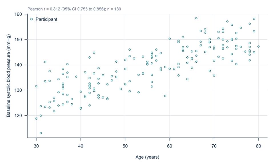
Begin by identifying the direction of the point cloud. An upward pattern suggests a positive association, whereas a downward pattern suggests a negative association. Then assess whether one straight line provides a reasonable summary. A curved pattern may still be strong but can be represented poorly by Pearson correlation.
Look for clusters that may correspond to treatment groups, disease subtypes or clinical settings. A single overall coefficient can combine distinct within-group patterns. This phenomenon can even reverse the apparent direction of association when group composition differs.
Assess the spread of observations across both axes. A correlation estimated among adults aged 30–80 years may be larger than one estimated only among adults aged 55–65 years because the latter sample has restricted age variation. The coefficient therefore describes the observed population and ranges rather than an immutable biological constant.
Choosing Pearson or Spearman correlation
Pearson correlation uses the original numerical distances. It is most informative when the research question concerns a straight-line relation and the observed values have meaningful quantitative spacing.
Spearman correlation replaces observations with ranks. It can summarise a steadily increasing or decreasing relation even when the curve is not linear. It is also suitable for many ordinal variables. However, ranking discards information about the size of differences and does not remove the need to inspect the plot.
The choice should not be made solely by performing a normality test. Neither age nor blood pressure must have a normal marginal distribution for Pearson correlation to be meaningful. Distributional assumptions become relevant mainly to the confidence interval and test under the selected sampling model.
Correlation matrices and multiple testing
A correlation matrix can be useful during data exploration, but a large matrix creates many potential comparisons. Twenty variables produce 190 pairwise coefficients. Selecting only the largest or statistically significant coefficients exaggerates evidence and ignores the exploratory search.
A planned analysis should identify the primary variable pair, report all relevant coefficients consistently and distinguish confirmatory from exploratory findings. Correlation matrices should also retain variable units, missing-pair counts and clinically meaningful labels.
Correlation with binary variables
When one variable is binary and the other numerical, Pearson correlation is mathematically equivalent to a point-biserial correlation. It summarises a standardised difference between the two groups. A direct mean difference with a confidence interval is often easier to interpret clinically.
When both variables are binary, the Pearson correlation corresponds to the phi coefficient for a two-by-two table. Risk differences, risk ratios or odds ratios usually provide more clinically interpretable association measures.
Worked example
Reproducible R analysis
make_hypertension_data <- function(n = 180) {
  set.seed(4583)
  i <- seq_len(n)

  data <- data.frame(
    participant_id = sprintf("H%03d", i),
    age = round(runif(n, 30, 80)),
    male = rbinom(n, 1, 0.5),
    bmi = pmin(pmax(round(rnorm(n, 27, 3.5), 1), 18), 40),
    physical_activity = round(runif(n, 2, 7), 1),
    telemonitoring = rbinom(n, 1, 0.5)
  )

  data$adherence <- 4 + runif(n, 0, 5) -
    0.015 * (data$age - 55) + 0.4 * data$telemonitoring
  data$baseline_sbp <- 92 + 0.52 * data$age + 0.85 * data$bmi +
    2.8 * data$male - 1.3 * data$physical_activity + rnorm(n, 0, 4)
  data$followup_sbp <- 58 + 0.47 * data$baseline_sbp +
    0.10 * data$age + 0.52 * data$bmi - 2.0 * data$adherence +
    2.0 * data$male - 4.5 * data$telemonitoring -
    0.55 * data$telemonitoring * (data$bmi - 27) +
    0.006 * (data$age - 55)^2 + rnorm(n, 0, 5)

  data
}

hypertension <- make_hypertension_data()

pearson <- cor.test(
  hypertension$age,
  hypertension$baseline_sbp,
  method = "pearson",
  conf.level = 0.95
)

spearman <- cor.test(
  hypertension$age,
  hypertension$baseline_sbp,
  method = "spearman",
  exact = FALSE
)

pearson
spearman

plot(
  hypertension$age,
  hypertension$baseline_sbp,
  xlab = "Age (years)",
  ylab = "Baseline systolic blood pressure (mmHg)"
)
Cleaned R output
Method      Estimate   95% CI          p-value
Pearson       0.812    0.755 to 0.856  <0.001
Spearman      0.818    not shown        <0.001
Base R implements these methods using cor.test() [2].
Interpreting the output
Presenting the results
Present the scatter plot together with the correlation estimate, confidence interval and sample size.
Visualising the association
Suggested reporting
Range restriction and agreement MMed extension
Restricting age to a narrow subgroup can reduce the observed correlation even when the underlying relation is unchanged.
Measurement agreement requires methods such as Bland–Altman analysis rather than correlation [3].
Common mistakes
Knowledge check
Why should a scatter plot accompany correlation?
Answer and reasoning
It reveals curvature, outliers, clusters and range restriction that one coefficient can conceal.
Does r = 0.812 prove age causes higher blood pressure?
Answer and reasoning
No. It is an unadjusted association and may reflect other variables or selection processes.
When is Spearman correlation useful?
Answer and reasoning
When the target is monotonic rank association or raw numerical distances are not defensible.
Can devices have high correlation but poor agreement?
Answer and reasoning
Yes. Their readings may rise together while one is systematically biased.
What does r squared mean here?
Answer and reasoning
It is the proportion of sample variation associated with the fitted linear relation in simple regression, not a causal fraction.
Key take-home messages
References
- Schober P, Boer C, Schwarte LA. Correlation coefficients: appropriate use and interpretation. Anesth Analg. 2018;126(5):1763–1768. https://doi.org/10.1213/ANE.0000000000002864
- R Core Team. Test for association/correlation between paired samples. R documentation, package stats version 4.6.1. Vienna: R Foundation for Statistical Computing; 2026. https://stat.ethz.ch/R-manual/R-devel/library/stats/html/cor.test.html
- Bland JM, Altman DG. Statistical methods for assessing agreement between two methods of clinical measurement. Lancet. 1986;1(8476):307–310. https://doi.org/10.1016/S0140-6736(86)90837-8
These notes support learning and research planning and do not replace statistical consultation for a specific study.